New Site Update with Refreshed Experience!

Introducing Harmonic Honey Bee
For the past year our development team, led by Rom Stevens and recently joined by Roy Flores, have been refactoring the entire user experience on Blender Market from top to bottom. They have replaced the front-end framework we use to make the site more modern, stable, more enjoyable, and ultimately easier to develop new and improved functionality. At first glance it may not seem like a big change but this was a massive project that involved changes to 902 files with 23,313 code additions and 34,202 deletions. Take a bow Rom and Roy👏🏻
Aside from making Blender Market easier for our team to work on, ultimately the goal was to make it easier for you to use and work in. Let's take at looks at what's changed!
New upload system
We're very excited about this one. The old upload system for product images and files was rife with problems and more than a little frustrating for many Creators.

That old system has been replaced with FilePond, a powerful javascript library that enables far more functionality and ease of use. Files may now be uploaded with Drag and Drop, you can upload multiple files at once, and it allows you to re-order images. Support for re-ordering product files is coming in a future site update.
The underlying architecture for uploads is also dramatically improved so you should see better performance on large files, particularly on spotty internet connections
New WYSIWYG editor
The WYSIWYG editor has also been replaced. Blender Market now utilizes Summer Note, a simple (yet powerful) editor built on bootstrap, the same front-end framework we're using for the rest of the site.

Aside from being more reliable and easier to use Summer Note enables new functionality that'll make creating beautiful product pages easier.
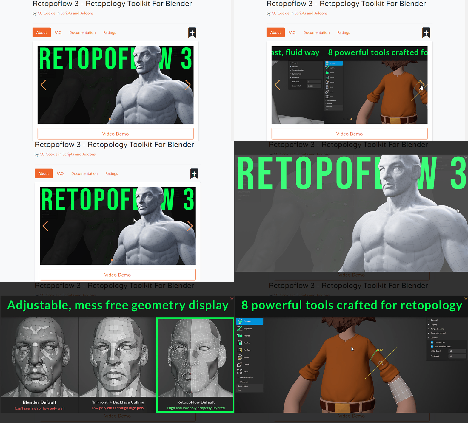
Improved image navigation

Mobile support
The site, including Creator's backend, are now mobile compatible. Previously mobile support was marginal, at best, now you can browse on the go from the device of your choice.

Other updates
In addition to the above features, here's a few other quick highlights that's less obvious but no less important to the usability and stability of Blender Market:
- Added support for images in product support messages
- Upgraded Ruby on Rails from version 5 to 6
- Better reports for Creators
- New product search filters
- Updated styling
One huge point of this update, that might normally go unnoticed, is this huge front-end refactor clears the way for future improvements that are planned. With the front-end refactor complete we will now be able to move our focus back to functionality and security, such as building a much more powerful payout system for our Creators, improving the search filtering options when looking for products, and we aim to overhaul the refund system, putting more control into the hands of Creators. Some other plans include product rating and review improvements and new payment options while purchasing.
Ultimately, we hope that this update improves your experience on the site, whether buying or selling. Should you have any feedback the team would love to hear it! Please leave a comment below and let us know what you think.
Albert Makac
over 1 year ago
congrats!
Matthew Muldoon
over 1 year ago
Thanks Albert!varkenvarken
over 1 year ago
I love it. I can go to my inbox now without being forced to use portrait, yeah! 🥳
The only thing i miss now is native emoji support in the blog reply editor, now i have to cut and paste. 😁
But no kidding, it looks great, kudos to all involved.
Matthew Muldoon
over 1 year ago
Thanks, I'll make a note for the emoji support!dodeqaa polyhedra
over 1 year ago
Please enable purchases to be sorted into user defined libraries via folders/collections?
Right now they are tagged to invoices, which is great for paperwork but not so for organizing purchases via workflow/pipeline.
Also, it would be great if purchases in the library could have a notification icon highlighted whenever creators update their products.
That way users can log into their libraries and see if any products have been updated.
Creators will also have another channel outside of emails to notify users regarding updates.
dodeqaa polyhedra
over 1 year ago
Please also add a search bar for libraries?Juliano
over 1 year ago
Congratulations! Agree with Ioic suggestion. In fact, it would be great if you developed an app to manage updates automatically.
Hanterdro
over 1 year ago
Happy to see the improved mobile support 👌
When will we see gift cards and store credit?